After WWII the world’s passenger liner fleet had been decimated yet again. Apart from the Cunard Line, all other lines needed to rebuild their fleet. Cunard saw Queen Mary and Queen Elizabeth survive the war unscathed and could finally start the two ship service they had been planning for so long.
British liner companies still faced the same challenges as before the war, they wanted to present tonnage with more modern interiors but were scared of the reaction of the travelling public, especially the conservative British. Both Cunard and P&O hired famous interior architect Jean Monroe from London who was known for her country house style interiors complete with draperies and chintz upholstered furniture. An exception was the Orient Line whose CEO Colin Skelton Anderson had teamed up with Brian O’Rorke as described in our article on inter war liner interior developments. Their newbuilding Orion (1936) had been an instant succes, being the first liner with modernist (some say Art Deco but these styles overlap) interiors. Orcades, Oronsay and Orsova followed with the same interior design approach.
O’Rorke not only was responsible for their interiors, but also for the artwork on board, cutlery etc. But although Anderson and O’Rorke set out to create modern vessels, they also did not want to overdo it, resulting in modern but not overwhelming interiors.
Italy faced the same problem, they needed new liners and fast, but all they had left were four ships dating from the 1920’s all completely run down during the war. They were Saturnia (1927), Vulcania (1928) and two Conte-class ships, Conte Biancamano (1925) and Conte Grande (1928). Conte Biancamano and Conte Grande were completely stripped of their interiors and a group of innovative architects were contracted, among them Zoncada, Ponti, and Pulitzer to completely redesign their interiors originally done in period styles and transform them into modern, calm spaces with contemporary artwork by Italian artists. However, at the time artwork still had a strong relation with Italy’s past which was clearly visible in both rebuilt Conte’s which presented a bit of a contradiction.
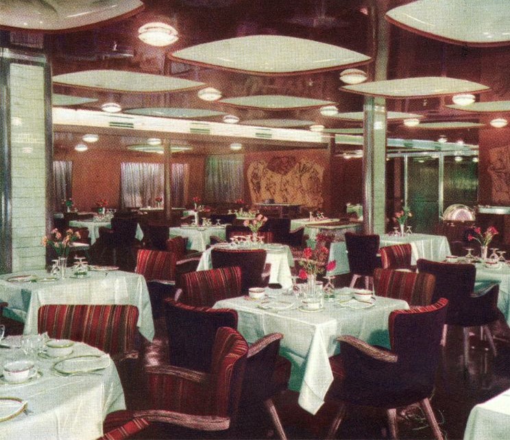
Newbuildings Giulio Cesare (1951) and Augustus (1952) featured three-dimensopnal ceilings, modern furniture by Cassini and spectacular artwork in some cases seemingly detached (floating) from its background panels.
In 1953 the new flagship of the Italian merchant marine, the Andrea Doria was launched, followed by a sister ship, the Cristoforo Colombo in 1954, Ponti, Zoncada, Rossi and others were responsible for her interiors.
Andrea Doria was the more glamorous of the two again featuring 3-dimensional ceilings but also mirrored walls, modern artwork and murals like on many other Italian liners referring to Italy’s classical and Renaissance history. Cristoforo Colombo’s public spaces were mainly designed by Pulitzer. As usual he delivered more quiet but nevertheless modern interiors.
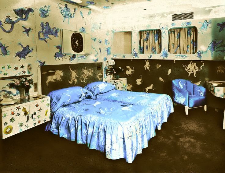
Aboard Andrea Doria were four luxury suites and the owners Italian Line awarded the design of each of them to different interior architects. Ponti, Zoncada, Minoletti and Puchand each took a different approach. One of them was done by Ponti and this time he made a statement with his design of the Zodiac Suite as he called it which was based on the signs of the zodiac and the constellations. He had artisan Piero Fornasetti design the graphics which could literally befound everywhere, on the walls, the furniture upholstery, bedspreads etc. When the Andrea Doria collided with the Swedish liner Stockholm in 1956, it was destroyed becuase it was exactly the Zodiac Suite where the Stockholm rammed the Italian liner….
In the US, post war liners interiors were continuing along the lines of the work of Raymond Loewy and naval architect George Sharp, as shown in the design of three liners delivered to the Panama Line, Panama, Ancon and Cristobal just before the war in 1939. Their external profiles and interior design showed an obvious cohesion. They had rather bland, hotel like interiors without much decoration. After the Morro Castle fire in 1930, additional fireproof construction measures had been implemented by the US Government resulting in for example smaller public rooms so a possible fire could be contained and the use of only decorative thin veneers instead of flammable wood panneling.
The next step in US passenger post war ship design were the Independence and Constitution in 1951, built for American Export Lines for transatlantic service from New York to the Mediterranean. Henry Dreyfuss who stated that he “wanted to create a vessel which would clearly reflect the company’s style and showcase the best in modern American living” was responsible for their interiors Strikingly modern vessels were the result. For example fire retardant laminate was used in different bright coloured patterns and all cabins had warm, cold and even iced water from the same tap!
However, the US also wanted a “ship of state” like the British, French, Germans and Italians had operated on the North Atlantic so far. In July 1952 finally they had their moment of glory when their United States set a new record of 3 days, 10 hrs and 40 min with an average speed of of 35.59 knots smashing all existing speed records. She had been designed by naval architect William Francis Gibbs who had dreamed of building the ultimate ocean liner for most of his 40-year career. Concerning the ship’s technical specifications and lay-out, Gibbs made all of the decisions himself, he left his client, the United States Lines no room for discussion whatsoever. He wanted the United States to have an old-fashioned 3-class lay-out and was adamant that no flammable materials of any kind were used on board, apart from the butcher’s block and the Steinway piano. Rumour has it that he had asked for a non-flammable metal piano, but Steinway had kindly refused to build him one.
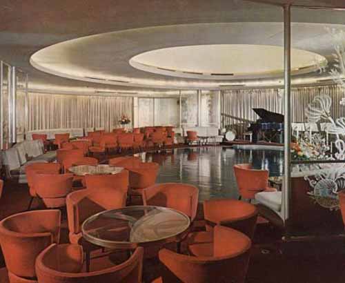
XXX Interior designers for the United States had to work with what Gibbs delivered in terms of lay-out. Dorothy Marckwald of Smythe, Urquhart & Marckwald was given the job of designing United States’ interiors. In them “cold” materials” like plate glass, aluminium and stainless steel were used: those were non-flammable as Gibbs had dictated. Within these limitations Marckwald succeeded in creating contemporary styled interiors, a combination of soft pastel backgrounds and bright coloured furniture, being limited in her use of material it was clear her choice of colours was extremely important. She added some interesting twists too like tables in the form of the ships’ propellors.
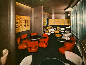
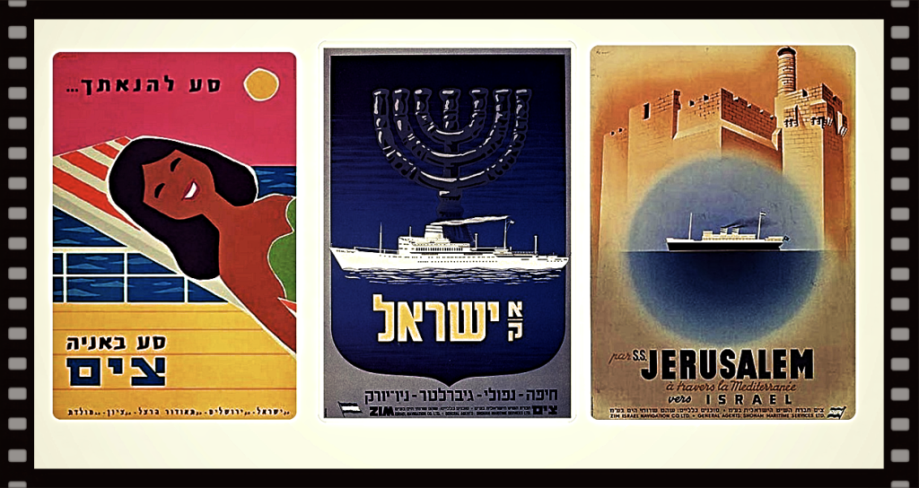
And then there was this small country, Israel. It’s most important passenger ships operating line was ZIM lIsrael Navigation which owned mostly older tonnage at the time. Shipping was one of the countries lifelines, being isolated by hostile neighbors in the Middle East. When Germany made financial reparations for the horrors of WWII and the Holocaust, ZIM Lines finally had the possibility to upgrade its ageing fleet with modern tonnage. Between 1955 and 1957, ZIM Lines (ZIM in Hebrew is a biblical word meaning “fleet of ships”) Israel, Zion, Jerusalem and Theodor Herzl. These ZIM Lines liners appeared with strikingly modern interiors, frameless glass doors, open stairs (with see through risers) and a colour scheme of turquoise, olive and purple, a nod to the countryside and coastline of Israel resulted in light, spacious, modernist interiors which were complemented with contemporary art by different Jewish artists like Ben Shahn and Yaacov Agam among others. These four liners also showed Scandinavian influences in their interiors, seen in more passenger ships during that period. With their interiors having been designed by Iraeli architects Al Mansfield, Munio Weinraub and the couple Dora and Yeheskel Cad, they were highly praised liners at the time, .
But slowly it became clear that the airplane was on its way to take over international liner services at a rapid pace. Some shipowners like the Italian Line were of the opinion that there would always be demand for liner services in the future and continued ordering inflexible tonnage with a rigid division of classes. Others like Holland America Line saw dramatic changes ahead and decided to already respond to these developments and be prepared for the future.
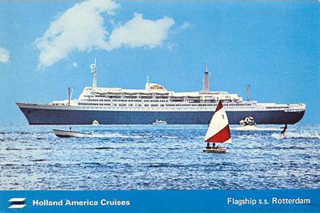
This led to the groundbreaking liner Rotterdam of 1959. Using sliding doors in her main stairtower, decks could be closed off for passengers of other classes, giving passengers access to all of the individual decks assigned to their respective class from stem to stern. This solution was the brainchild of HAL’s director de Monchy who had seen this at the castle de Chambord he had visited in France. The lord of the castle had this double corkscrew stairtower built so his wife could climb the stairs while at the same time his mistress descended the stairs without meeting eachother.
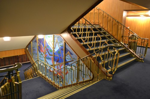
Rotterdam‘s interiors clearly showed dutch modernity, which at the time was represented by De Stijl, a dutch art, design and architecture movement which emphasized an abstract, reductionist aesthetic that focused on the basic visual elements of simple geometric shapes, lines and primary colors. While HAL’s former flagship Nieuw Amsterdam of 1938 had been an in art deco style designed liner, the Rotterdam was entirely different, being a modern contemporary styled vessel. Apart from the famous Delft Blue ceramics, the use of leather (even in the ceiling of the Smoking Room, some say this was to absorb the smell of tobacco), shining wood panneling and specific patterns like atoms and trapezium shapes which could be found all over the ship for example on the walls of her theatre.
Now passenger ship lay-outs followed two directions: Rotterdam, Kungsholm (1965, Swedish American Line) and Sagafjord (1965, Norwegian America Line) were examples of flexible designed vessels, they could switch easily to one class cruise service while ships like Leonardo da Vinci (1958, Italian Line) and France (1962, Cie Generale Transatlantique) still followed the route of stringent class divisions.
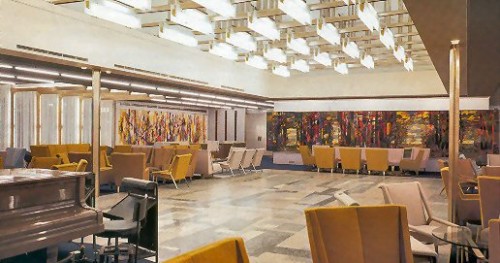
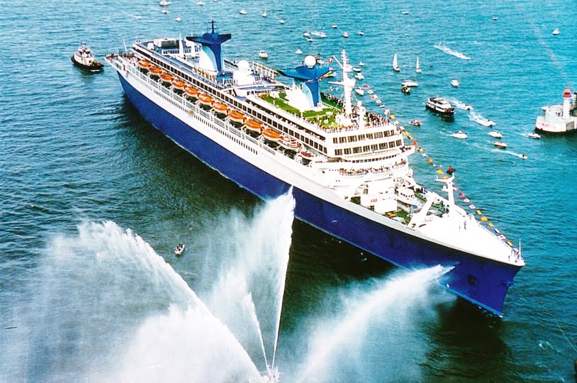
Already mentioned, France was constructed at Chantiers de l’Atlantique in St. Nazaire, France where before her famous liners like Normandie had been built. To prevent her from going up in flames like the l’Atlantique and Normandie, large open spaces were avoided and fire retardant materials were used in her interiors like metals and plastics. Her interior style was undoubtedly chic, as her double height first class dining room clearly showed. One entered via a red-carpeted flight of stairs. It featured a circular dome and brass panneling . Another piece de resistance was her Smoking Room, two decks high with its tapestry on the forward bulkhead by Jean Picart le Doux “the Phases of Time”. France was a two class vessel and her Tourist class was called “Rive Gauche” referring tot he Unniversity Quarter in Paris. Her bespoke aluminium furniture did not exactly radiate luxury nor comfort and was probably commissioned mainly for safety (fire retardant) reasons. Externally, her funnels soon became famous for their wings, which were – ironically – inspired by aircraft wings….. (in 1979, she was converted by a Norwegian shipowner Knut Kloster into a cruise ship, the Norway for his cruise line NCL).
Although during the sixties, several well-known liners were taken out of service like the Windsor Castle (1960, Union Castle Line), Empress of Canada (1961, Canadian Pacific) and Northern Star (1962, Shaw, Savill & Albion) none of them had actually had modern or groundbreaking interiors.
This was not the case with Orient Lines’ Oriana and P&O’s Canberra, two liners built for the UK – Australia / New Zealand – run.
They were both large, 41,915GRT and 45,270GRT and fast, so with strong demand for passage to “down under” money could be made.
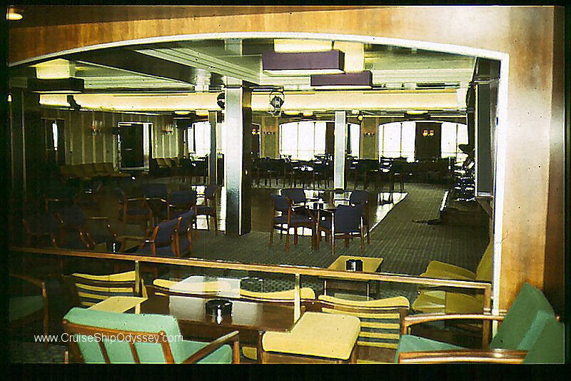
Although they were designed and built during the same period, they were constructed independently and emerged as totally different ships. Oriana followed the lines of Orion/ Orsova/ Oronsay/ Orcades. Misha Black coordinated the designs of of Oriana’s interiors and worked together with Brian O’Rorke, Orient’s regular interior leading architect. Other parties were involved too like for example Russel, Hodgson & Leigh who together with O’Rorke designed the first class dining room and cabins. Plenty of artwork could be found on board Oriana and her interiors were modern with both first and tourist class passengers enjoying a range of bright and well appointed public rooms that epitomised the latest fashions of interior design. This had always been a trademark of Orient Line since the introductiion of their Orion in 1936.
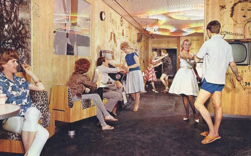
Sir Hugh Casson and his partner Neville Conder were responsible for Canberra’s interiors. Casson was widely known for his work for the Royal Family. He had worked on several rooms in Buckingham Palace and the interiors of the Royal Yacht Britannia. (1954). Canberra’s first-class public rooms were accessible via a spiral staircase made of white marble placed in a cylinder of dark Indian wood. From its lowest level where the Meridian Room was situated it rose 4 decks to the Crows Nest observation lounge. Lighting was concelaed in the balustrades, a nice touch. With Canberra P&O followed in the footsteps of Orient as for the first time on a P&O vessel, artwork and design furniture was added. Casson also designed different types of furniture for the ship himself. Tourist class accommodations and public rooms were designed by John Wright and Barabara Oakly. Never seen before were the walls of the Pop Inn, a coffee bar where artist David Hackney had burnt graffiti like drawings into the wall’s veneer. The Cricketers Tavern, a sports bar, featured cricket memorabilia on its walls and in vitrines. On Canberra, the courtyard configuration returned, where cabins are grouped around transverse corridors. Cabins on either side had windows facing the courtyard which had windows in the ship’s side. In this way inside cabins had some daylight. This solution was first seen on the Italian liner Saturnia (1927).
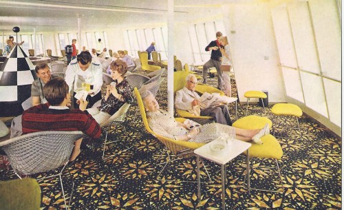
Two of the last ships with an “old-fashioned” inflexible 3-class lay-out were two impressive vessels built for the Italian Line: Michelangelo and Raffaello (both 1965). They were immediately recognizable by their funnels which featured highly unusual trellis like funnel casings developed by Turin Polytechnic. A long list of interior architects had been invited to work on Michelangelo: Gustavo Pulitzer Finali designed her first class dining room and hallways, Vincenzo Monaco, Amadeo Luccichenti and Nino Zoncada were responsable for the gorgeous first class accommodation, while Giulio Minoletti designed the tourist class spaces. In Michelangelo’s interiors strong colours and sharp angular forms were used with pieces of highly modern non-figurative art added. Alas both ships saw less than a decade of active liner service and in 1976 after a period in lay up they were sold to Iran to serve as floating military barracks.
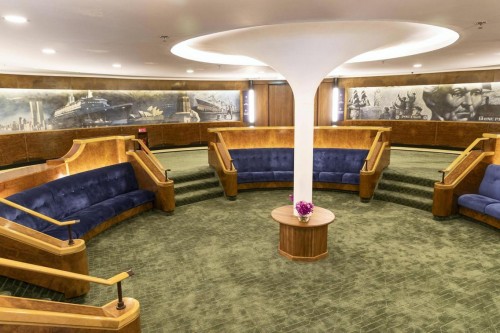
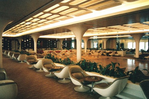
Cunard had been busy for some time with their Q3 project, a new liner to replace Queen Mary and Queen Elizabeth. The United States had been withdrawn in 1969, 5 years later the France and Cunard management saw the end of transatlantic service approaching rapidly. So the Q3 liner project was abandoned and instead Q4 was started, this time a liner which could double as a cruise ship. Cunard’s CEO, Sir Basil Smallpiece stated his main goal was to bring Cunard’s image and service “into the jet age” referring to his former job at the British Overseas Airline Corp. (BOAC). With Q4, Cunard wanted to get rid of its image of 3-class liners with old fashioned dark interiors. They hired Jamers Gardner to supervise her exterior profile design. As cruise ships tended to offer more facilities than liners, her superstructure would have to be built higher up as more decks were needed for additional public rooms. So it was decided to use lightweight aluminium. She would also have a completely deviant funnel design, a small funnel with a scoop at its base to lift smoke upwards. The hull was painted grey instead of the usual black and the name Cunard was placed on her forward superstructure in bright red capitals. Cunard advetrised the Queen Elizabeth 2 as she was named in 1969 as “The Space Ship” and indeed many of her public rooms were strikingly modern, like the circular embarkation lobby with the white fiberglass column at its center and ceiling featuring excentric rings. Fiberglass was also used in the columns in the Queens Room and its modern funiture and of course white lattice ceiling. Finally, the focal point of QE2 was the tourist class Double Room by Bannenberg, a showlounge with a dancefloor and stage at its lower level and shops which could be reached by a spiral staircase at its upper level. Dennis Lennon designed the three main restuarants on board, the Grill Room which was entered by a spiral staircase resembling the one used to acces the upper level seating onboard a Boeing 747, the first class Columbia Restaurant which was done in shades of brown leather and finally the tourist class Brittania restuarant which featured the colours of the Union Jack.
When she started in transatlatic service, only the Polish Stefan Batory and Soviet Alexandr Pushkin were her competitors on this route, but they were considerably smaller with significantly less amenities. QE2 outlived them both and during her career also became a most successful cruise ship. She was by far the most publicized passenger ship of all times. In 2008 she was retired and replaced by Queen Mary 2 on the transatlantic run. She was sold to the emirate of Dubai for 100 mio dollars and after a period of lay up opened as a floating hotel, nightclub and museum in Port Rashid, Dubai. She is gradually being restored although several iconic public spaces like the Double Room and Britannia restuarant still need work.
During the sixties, cruising almost completely replaced liner services all around the world. Companies now adertised sailings to tropical waters instead of liner transportation from A to B and liners needed to change to one class cruising in order to survive.
In Part IV we will describe how interiors of cruise ships evolved from the small 20,000GRT vessels introduced in the sixties to today’s mega cruise ships, luxury cruise yachts and expedition vessels.
